Get In Touch
Financial Planning SaaS
Summary
This financial planning SaaS solved a real problem: we needed to move off a technology platform that was being phased out by modern browsers.
It also created an opportunity to shift the product from a cash-flow approach in the SaaS to goal-based planning.
Goal based planning is more modern approach and was well researched before I started on the project.
Lead Product Designer (UX) and Researcher
Financial advisors and clients; 15 user interviews
Product team + Engineering; UX team of five
KPI definition using Google HEART (50+ to 16), focus groups (existing), interviews, prototyping, usability testing (prototype + production code), card sorting, IA and mental models
The Problem
The existing product was built on technology platform that was being phased out. That created real risk of degraded performance and an potential to eventually break access for advisors.
To top that off, the core data-gathering experience was slow, unclear, and error-prone, which blocked advisors from getting prospects to value quickly.
The workflow had too many steps, unclear navigation, and saving changes could take over a minute, leading to poor outcomes in internal and advisor testing.
We needed to modernize the platform and use the transition to shift from cash-flow planning to goal-based planning.
Goal based planning better matches how clients talk about why they want financial help and aligned well with their mental models.
The Outcome
Reduced the core data-gathering flow from 12 steps to a staged workflow with clearer progress and fewer dead ends.
Improved time-to-value by enabling an initial retirement assessment in 5 minutes with minimal input, making the product credible earlier in the advisor-prospect relationship.
Increased task success and reduced confusion in testing through clearer step framing, improved navigation, and simplified required inputs.
De-risked the build by validating designs in prototypes first and then verifying behavior in working code, cutting late-cycle rework.
Improved cross-functional alignment by converting a broad vision into 16 measurable experience KPIs, giving stakeholders a shared definition of success.
Established a repeatable UX process inside Agile that made research, critique, and validation part of delivery instead of a side project.
Kickoff
Research
Sketching and Building
Testing
Project Kickoff
The product team had a business case and vision statement.
I took that vision and translated it into 50+ potential KPIs to measure.
Using the Google HEART framework, we narrowed the list to 16 discrete, measurable, experience-related KPIs that guided decisions throughout the project.
Project Kickoff
The product team had a business case and vision statement. I was able to take that vision statement and break it down into 50 + potential KPI’s to measure. Using the Google HEART framework we whittled the list down into 16 discreet and measurable experience related KPI’s that we would leverage to drive decisions throughout the project.
Research
Before I joined, the product development team conducted focus groups with several customers of the existing tool.
We leveraged that research and added user interviews and testing of both prototypes and working code.
I created the research plan, interview protocol, and a usability testing plan to evaluate each feature. We built a prototype prior to development, then followed up with usability testing on production code.
Interviews were conducted in person, by phone, or over Skype as needed.
Research
The product development team had conducted focus groups with several customers of the existing tool prior to my joining the team. We would leverage their research and supplement it with user interviews and testing of both prototypes and working code. I created a research plan, and protocol for the interviews along with a testing plan that tested each feature in a prototype prior to development and then followed up with usability testing production code.Interviews were conducted via the phone or Skype when possible.
Opportunity Area
One of the most critical steps in working with clients is gathering their financial information.
Typically, collecting this information takes time for data entry that could be better used elsewhere.
The goal was to create as much value as possible with minimal client details.
Initial Research Outcome
Organizationally, we had a reasonable base of primary qualitative or quantitative research. However, we needed conversations with advisors to understand what the transition from prospect to client looked like, and what the key moments in the journey were.
Guiding questions for researching data collection (across multiple topics):
- When in the advising process do you learn about a client’s goals? What matters most to them?
- Do clients view goals as the primary reason they come to you for help?
- What recommendations are you currently making most often?
- Do clients like to discuss goal priority and tradeoffs?
- What is the minimum information you need to collect to define a goal for a client?
- What is the minimum asset and income information needed to show goal funding?
We conducted 15 user interviews in total. Interviews were done in person with users who mapped to our project personas, including advisors and clients.
We used the interviews to identify themes, insights, and opportunity areas. We worked through these collaboratively with the team through workshops, critiques, and feedback sessions during design validation.
We also learned how advisors structure data gathering in their conversations with prospects.
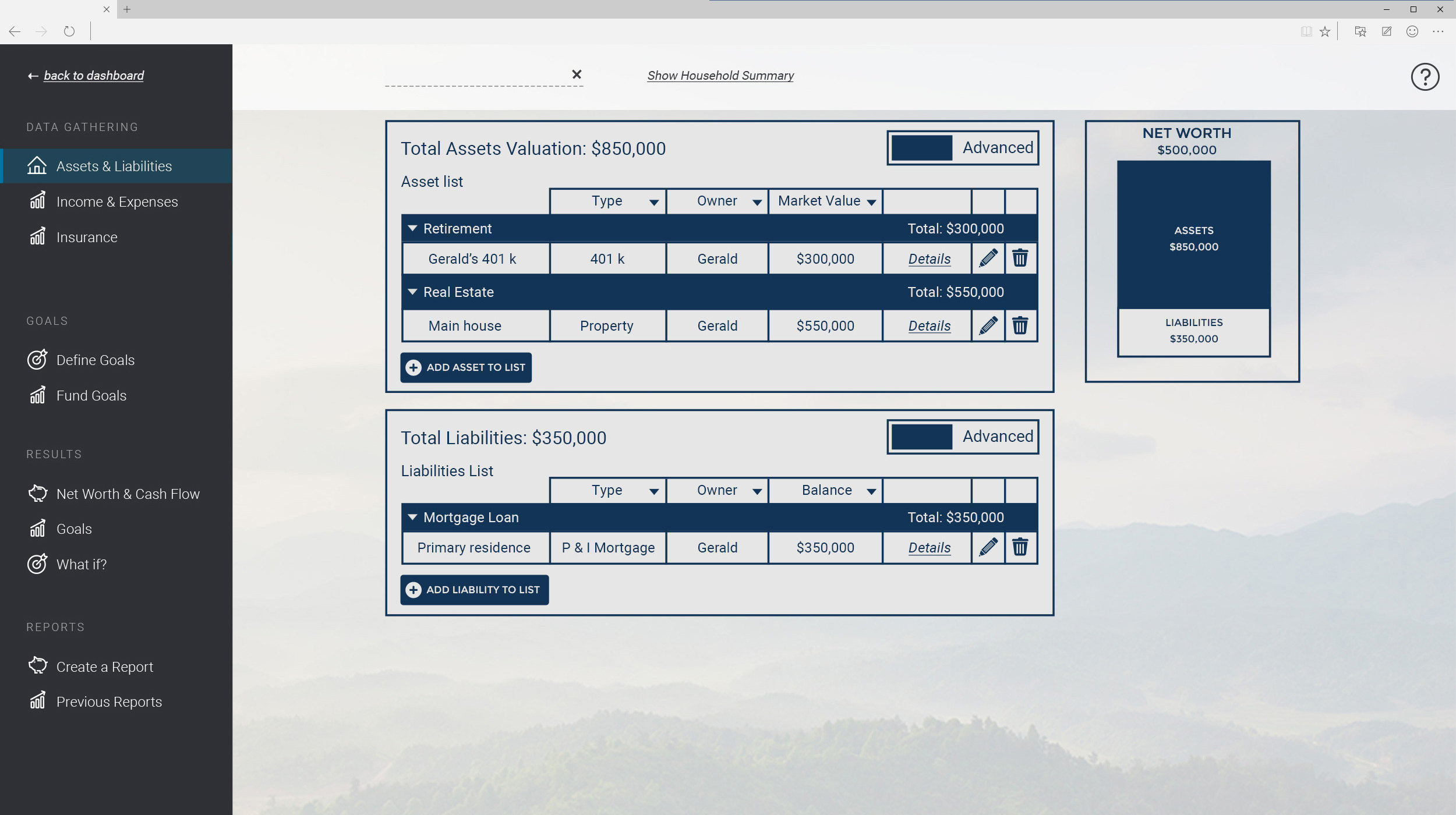
Previous Version
Above is an example of the previous experience for gathering client data.
There were a lot of steps, the navigation was unclear, and saving changes took over a minute.
Testing, both internally and with advisors, produced poor outcomes.
There were also significant usability issues. Between nested dialog boxes, terminology, data gathering, and accounting methods, almost everything needed to be reconsidered.
Information
Architecture
We explored many approaches to organizing and structuring the new application.
Eventually, we settled on a mental model of understanding the need, showing the need, and planning for the need as the organizing principles.
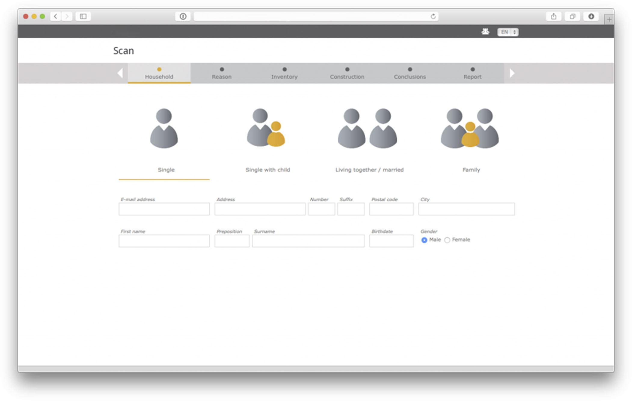
Brainstorm
I started by writing the design challenge on sketchbook paper so it stays front and center while I sketch.
For this feature, the challenge was:
How might we drive value for the prospect with minimal information? How might the experience scale as a prospect becomes a client?
Here are some approaches we explored. These were later developed into wireframes for testing.
Proposed Versions
Feature : Data Gathering
We made many information architecture changes as we tested how users understood the phases of work in financial advising.
After reviewing the research, we concluded we needed to generate a retirement assessment in 5 minutes that created value for prospects, clients, and advisors with the least amount of input.
The goal was speed, but also scalability. We needed the system to support deeper detail as the relationship between advisor and prospect (or client) evolved. These are a few examples of the approaches we considered.
What We Learned
Explored concepts, then made internal decisions about what to build for the first round of user testing.
From internal testing:
Clear steps were viewed positively. A goal-based approach with stages for collecting information and mapping it to desired outcomes tested well.
There was also debate about which calculations mattered most for creating value for prospects and clients.
We wanted a more comprehensive solution than a simple retirement calculator, while still keeping data collection fast and approachable. “TurboTax for financial planning” became a guiding principle.
Aligned on an approach that combined goal-based planning with minimal data collection. We built low-fidelity prototypes to test, and early rounds were primarily internal.
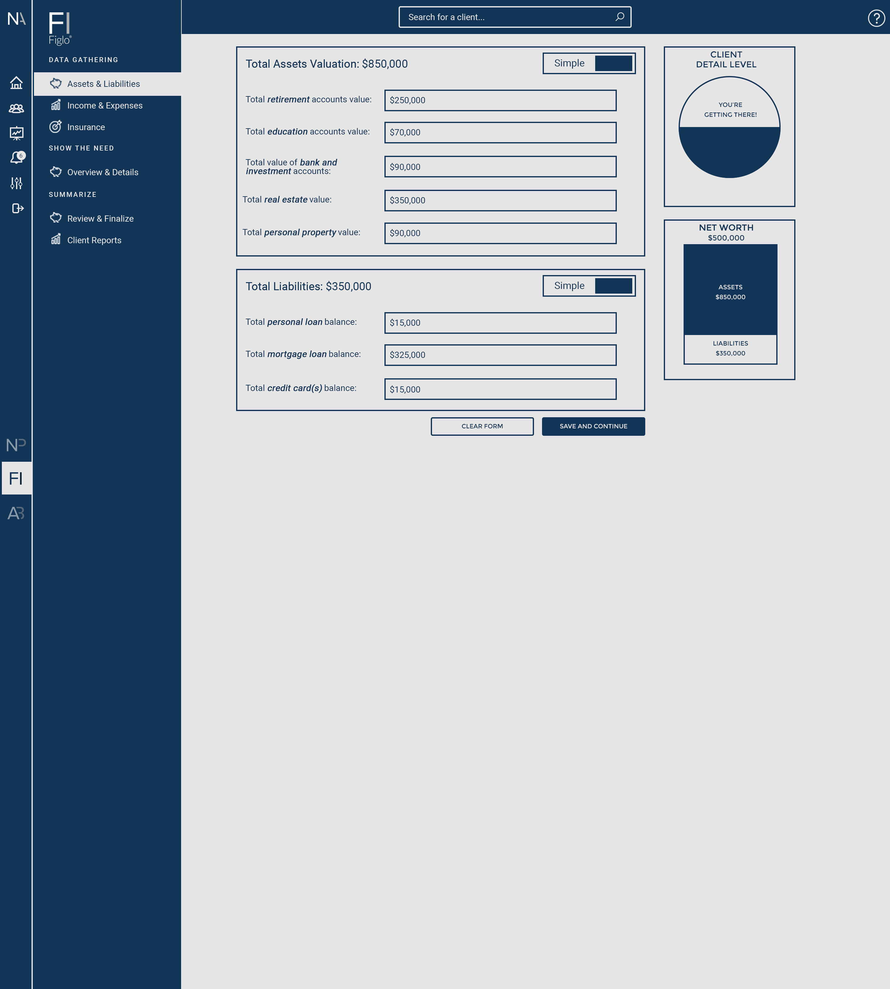
Current Version
The above reflects what the prototype and functioning code looked like at the time I left the company.
We tested this version of the data-gathering workflow three times before I left.
Tested with 10 users and internal stakeholders.
Findings:
Found that expenses were difficult to capture. There was significant discussion about which expense categories to include. Card sorting research helped inform the decisions that made it into the prototypes.
Collecting household information is a required step that needed to be as painless as possible.
Prospects and clients tend to think about their finances as goals they want to achieve, not as cash flow. We put a lot of effort into emphasizing goal-based advising over a cash-flow-first model.